

Commonwealth Bank of Australia
2020
Branding
2020
Branding
Whether someone is arriving in Australia for the first time, is looking to set up a bank account or has come from a long line of people who bank with Commbank, the new logo and identity aims to create a sense of presence, stability and groundedness.
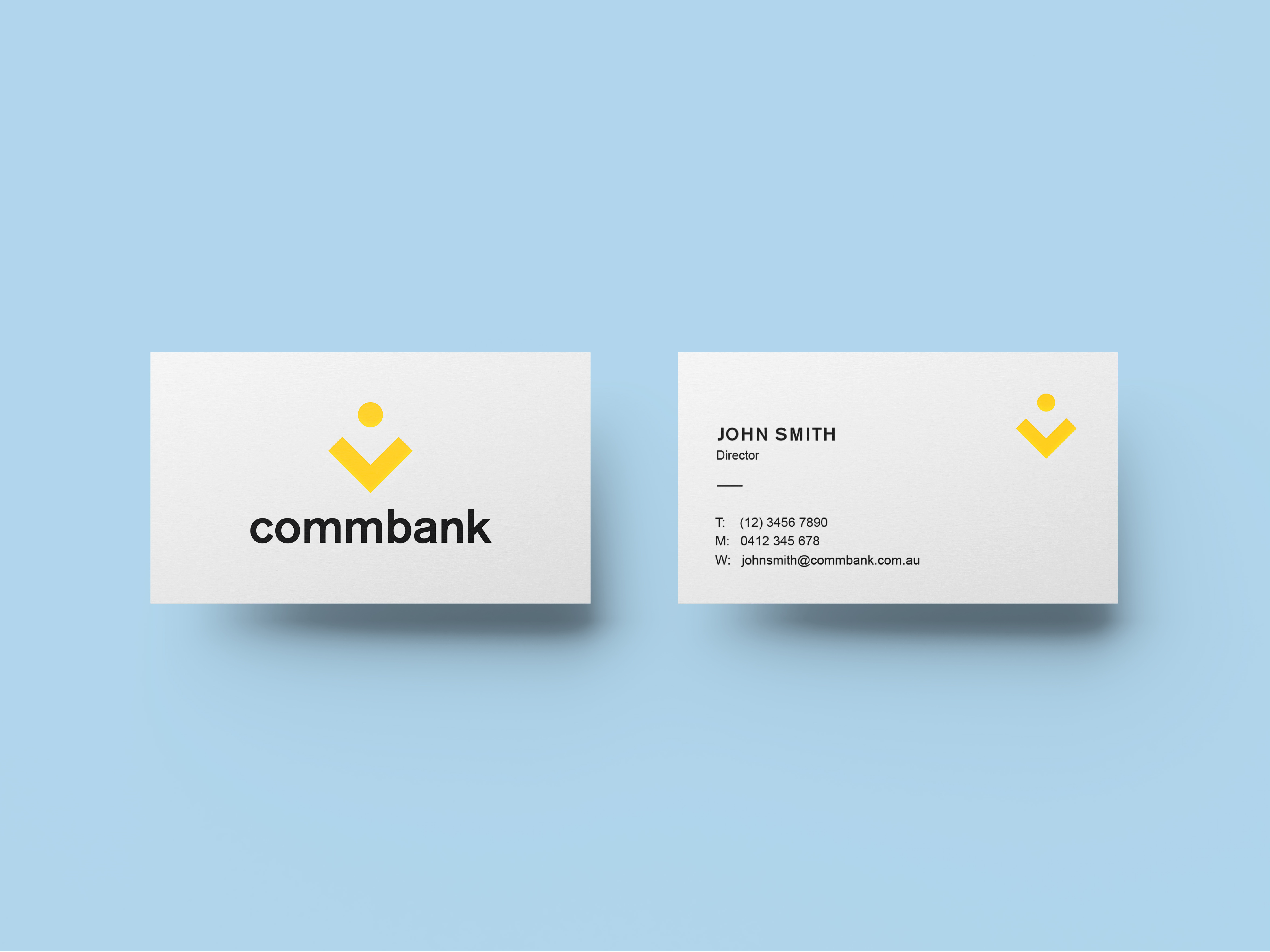
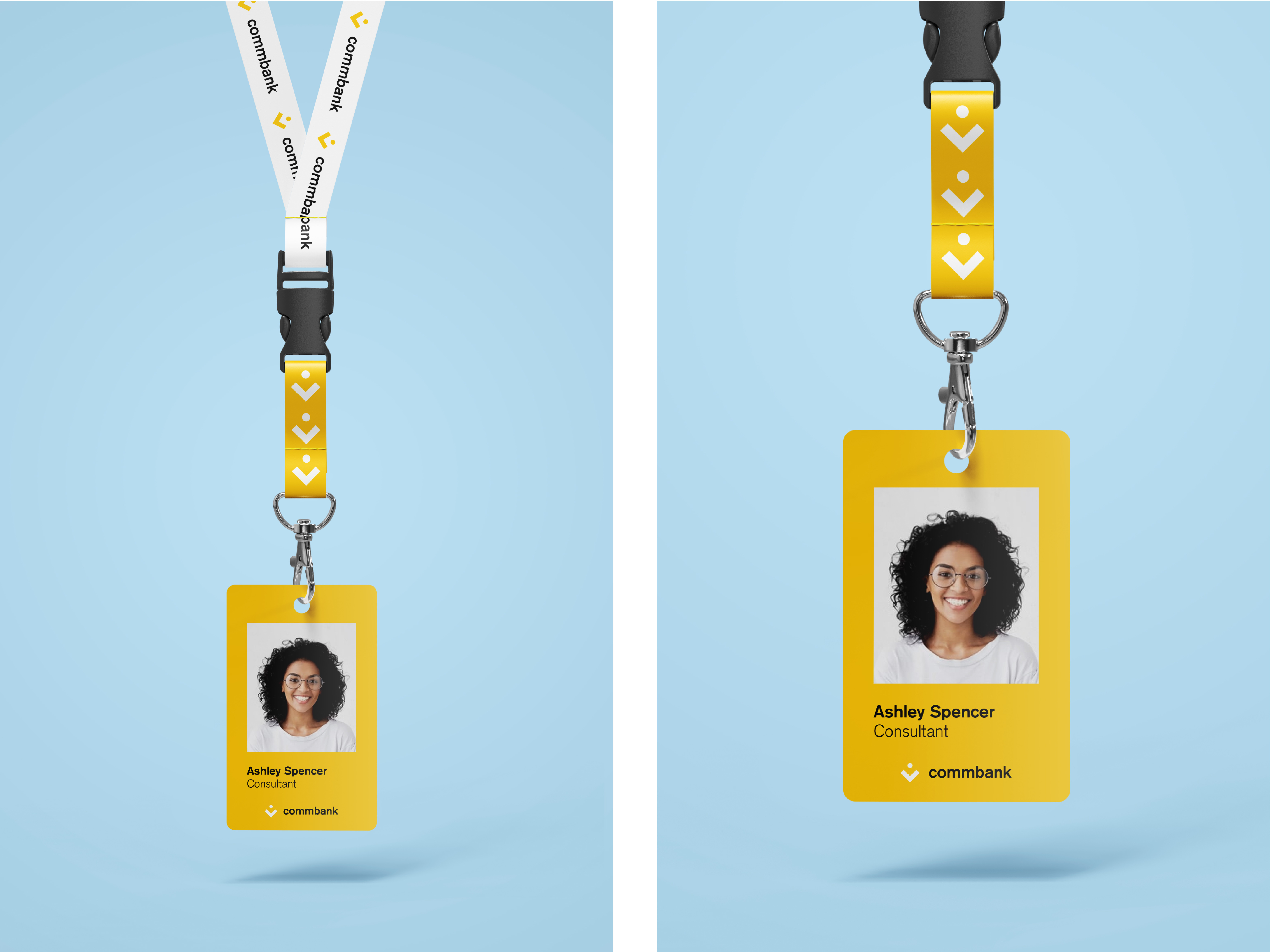
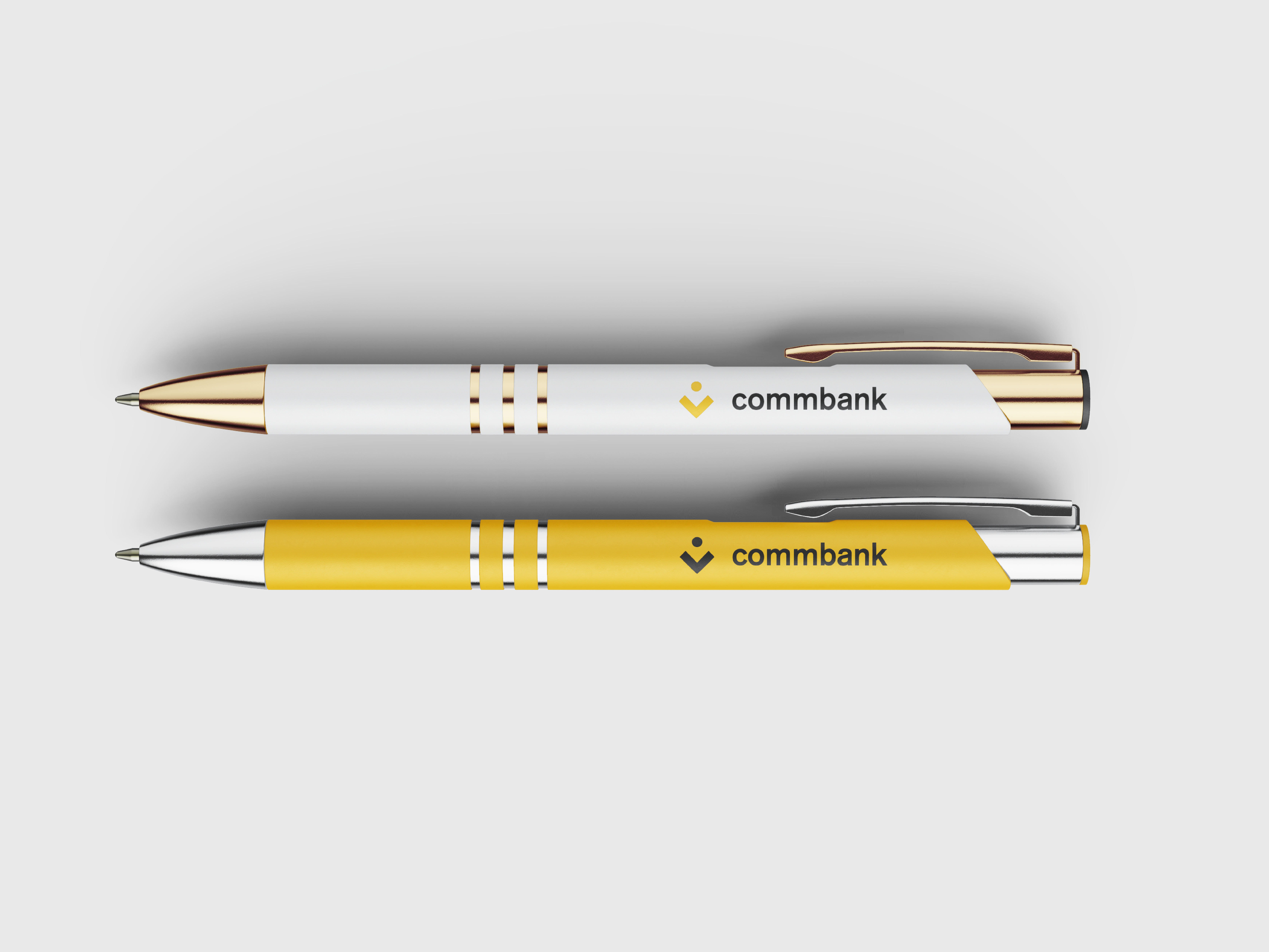
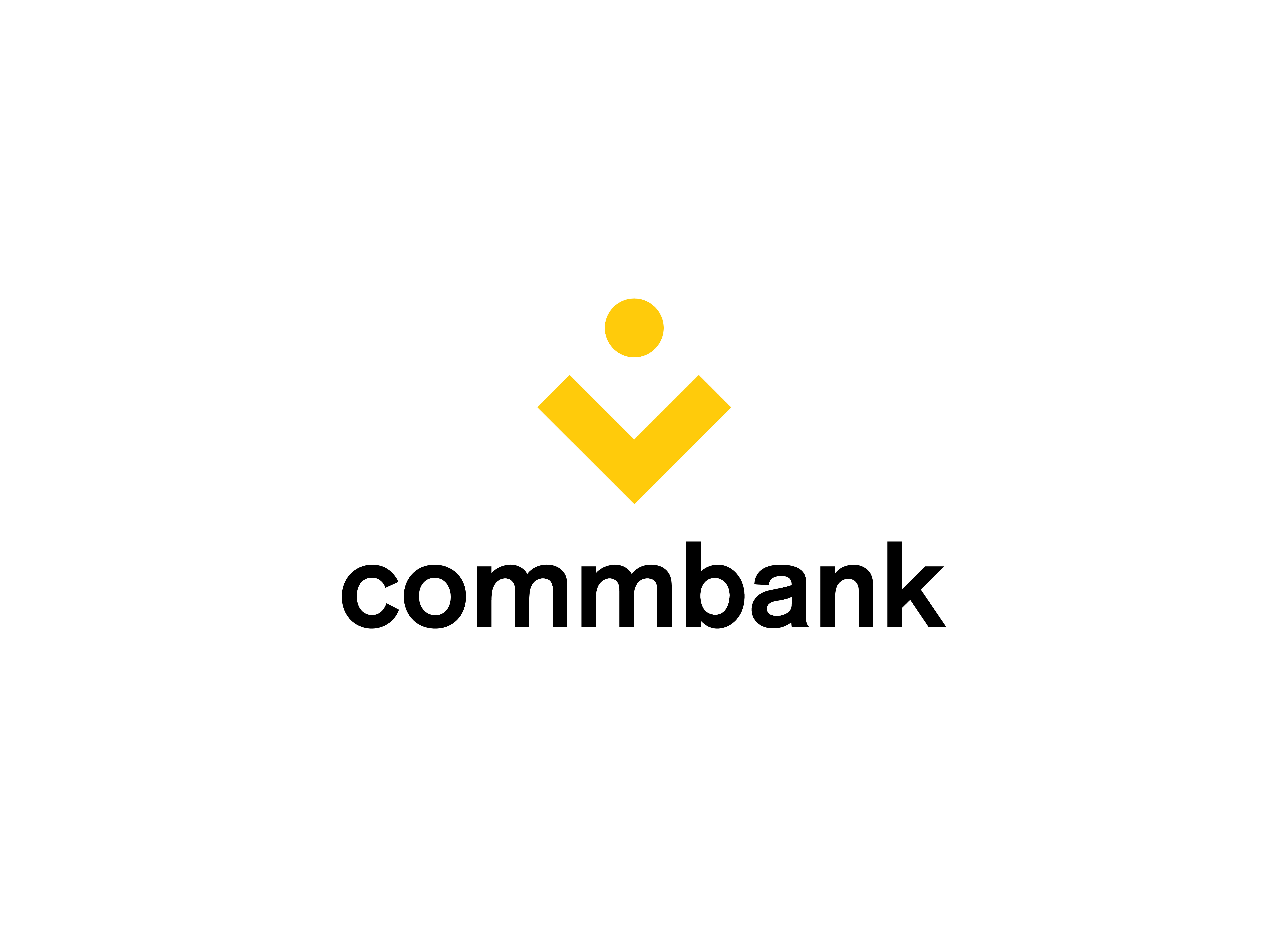
I have re-interpreted the diamond-shaped profile of the current logo as an arrow, breaking the diamond into two elements – a v-shape and a circle. The new logo, also resembling a coin in the palm of someone’s hand, can be used as a branding and wayfinding system with its orientation denoting and evoking senses of arrival, departure, groundedness and progression.
While imagery and symbols in the world of bank branding systems that point downwards or backwards are commonly associated with debt, financial ruin and instability, the arrow of the proposed Commbank logo intends to produce a feeling of guidance and trust as it points towards the word ‘commbank’.